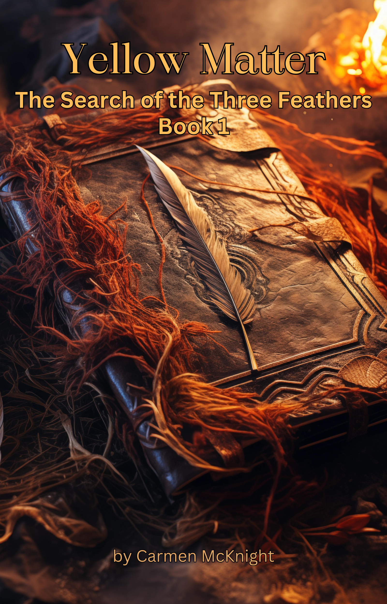
I like the 1st one the best, but I think if the font was different it would read and look better.
Rebecca says your name is to small. 😁 (Give your self more credit!) And a little more open space above the book graphic would help with being able to read the title better or a bolder font.
Love the feedbacks! Thank you:) I’ll make some adjustments, so far 99% positive votes for the 1st cover, so that’ll be the one I’ll choose:) Have a great day:)


I like the 1st one the best, but I think if the font was different it would read and look better.
Rebecca says your name is to small. 😁 (Give your self more credit!) And a little more open space above the book graphic would help with being able to read the title better or a bolder font.
I hope this helps. 😊
LikeLike
Love the feedbacks! Thank you:) I’ll make some adjustments, so far 99% positive votes for the 1st cover, so that’ll be the one I’ll choose:) Have a great day:)
LikeLike